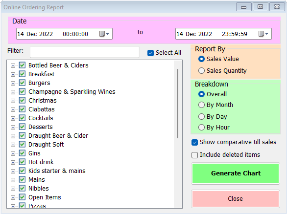
This report builder allows you to analyse sales made via the WebApp, against till sales or in isolation.

To begin, select the date range you wish to analyse at the top. In the list on the left you can select individual categories or sale items (expand each category by clicking on the ‘+’ sign to display its sale items). By default, all items are selected. If necessary, you can include deleted items by selecting the check-box on the right of this list.
On the right-hand side of this form there are further options. Firstly, you can report on sales value or sales quantity. The former is selected by default but if you simply want to see how many items have been ordered, choose the sales quantity option.
Next you can specify the breakdown type. Overall is the default but depending on the length of the overall date range selected you may choose to break down results by month, day or hour. Naturally, your overall range must include multiples of whichever you select in order to be meaningful.
Finally, you can choose whether to compare the online sales to the sales recorded through the till(s) in the same period.
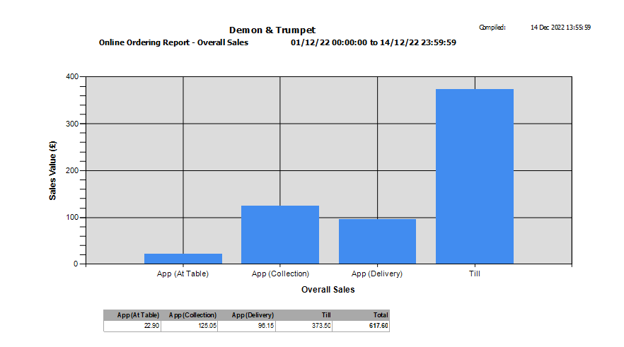
Once you’ve made your selection, simply click ‘Generate Chart’. You’ll see a report like this;

Online sales are broken down by type, and to the right is the till sales if you’ve left that option selected. Underneath the chart is a small table with the figures used to generate the chart.
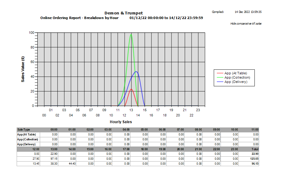
If you select one of the breakdown options other than Overall, you’ll see a line chart rather than a bar chart. Below is an example of the hourly breakdown.

Again, the figures used to generate the chart are shown underneath, giving the breakdown by each hour of the 3 types of online order (till sales have not been included in this example).
